
TERRENE Skincare
A body care identity and packaging concept built around natural textures, forest ingredients and a quieter way to communicate natural self-care.
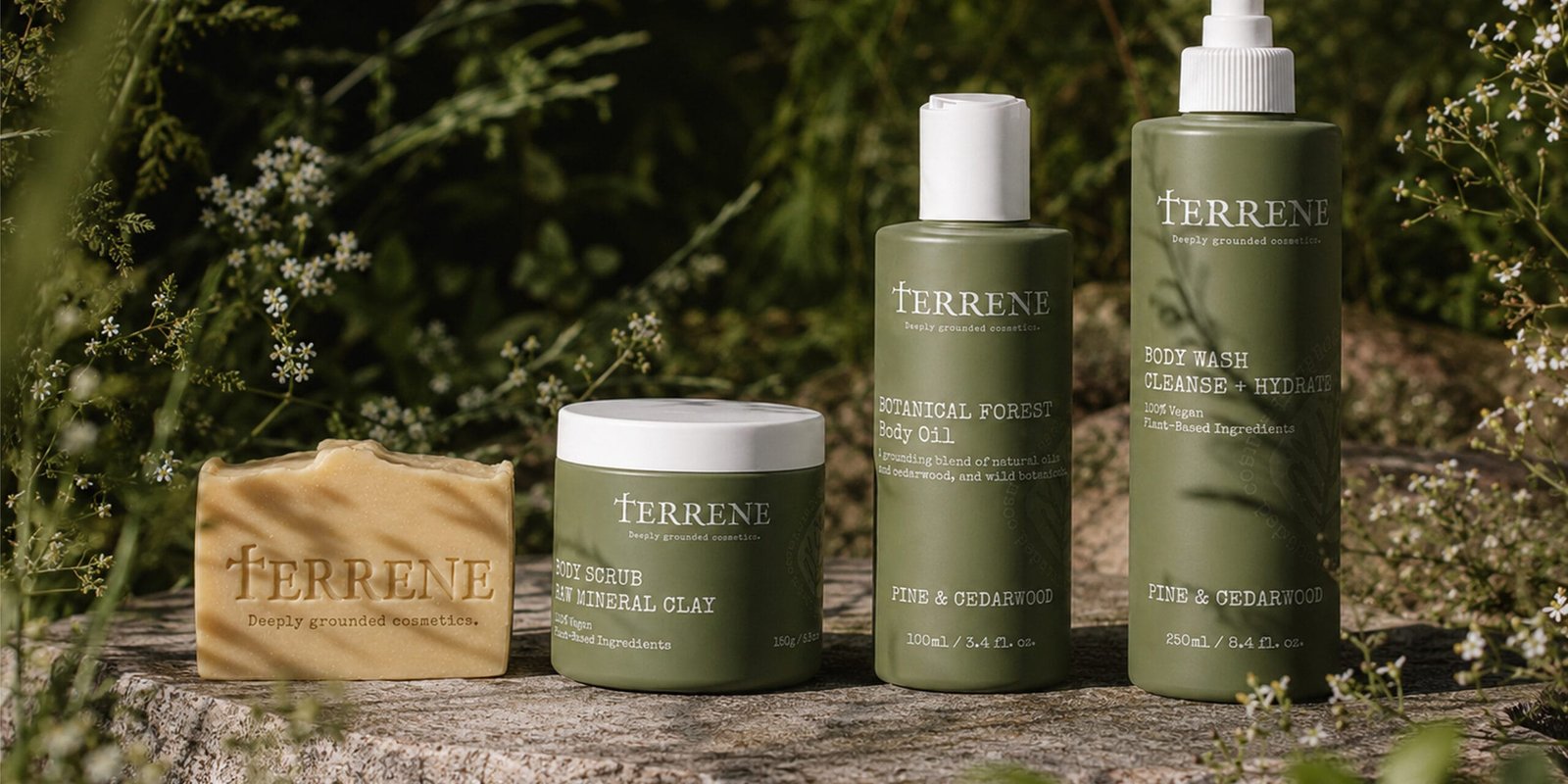
A brand world shaped by earth, texture and ritual.
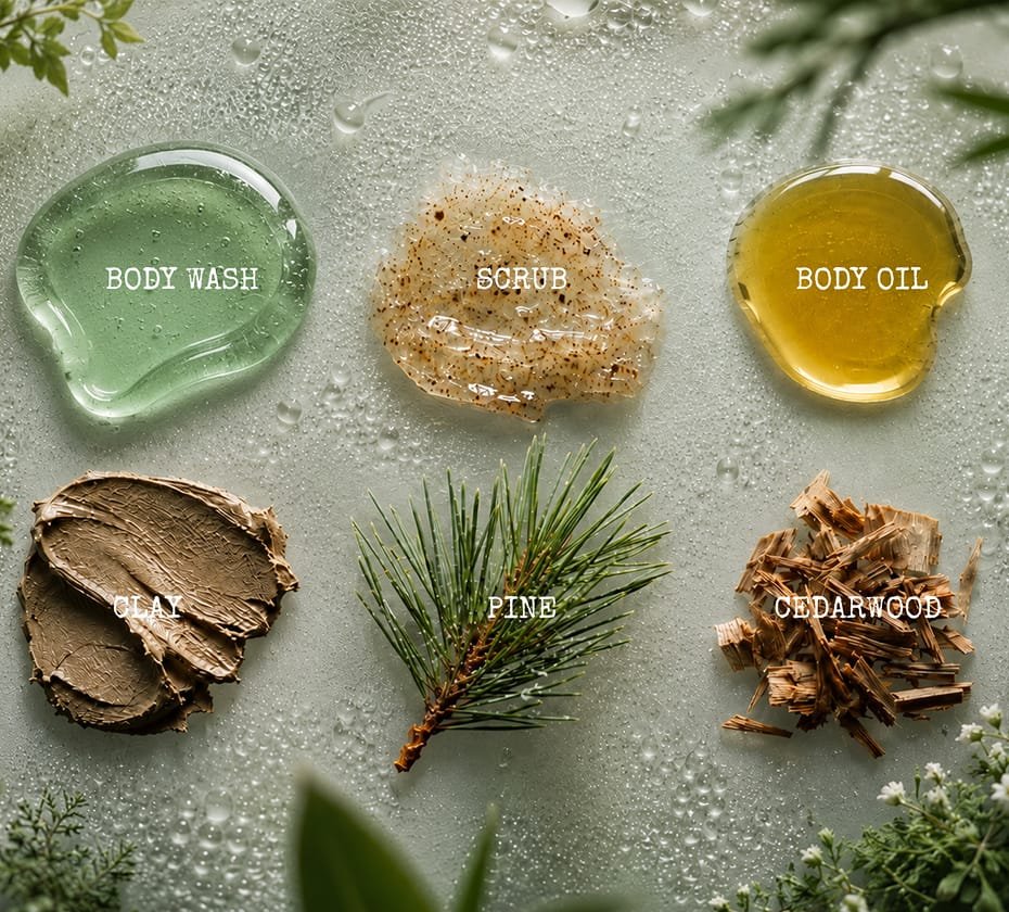
TERRENE imagines a natural body care line connected to mineral clays, pine oils, botanical extracts and slow everyday routines. The visual direction needed to feel grounded and tactile, without becoming rustic or overly decorative.
The aim was to create a product identity that could sit naturally across bottles, labels, sachets and soft brand materials while keeping the range calm, recognisable and easy to navigate.
Natural cues translated into a clean product system.
The identity uses a compact wordmark, an organic symbol and a restrained palette inspired by clay, cream tones and forest green. Instead of relying on glossy beauty codes, the concept works with texture, spacing and quiet contrast.
The mark combines botanical and mineral references in a simplified form, giving the brand a distinctive sign that can be used across packaging, labels, small applications and product-family details.
A tactile identity designed to move across product formats.
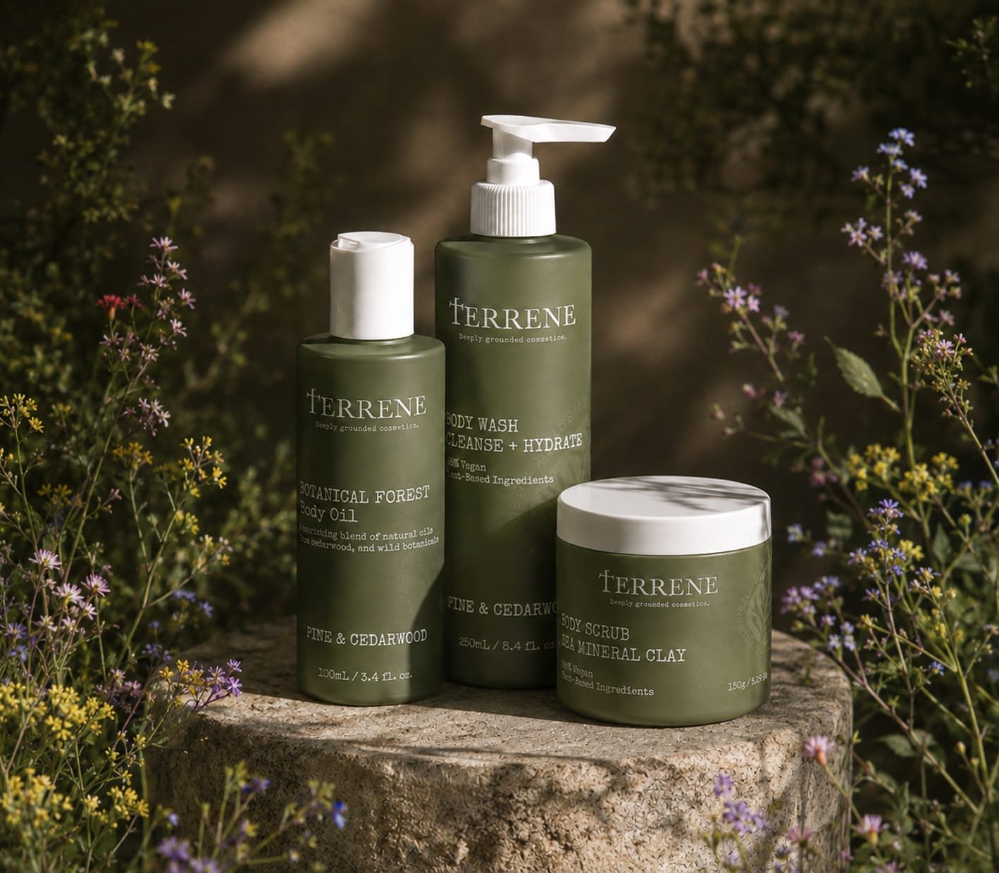
The final direction creates a cohesive visual language for the TERRENE range, from primary packaging to supporting brand materials. The system is built around recognisable typography, consistent layout logic and details that support a natural body care experience.
The result is a concept that feels quiet and material, while still giving the product family enough structure to expand into future applications.
Creative direction, mood, colour palette and visual atmosphere for a grounded natural body care concept.
Wordmark, organic symbol, monogram logic, typography and supporting graphic language for brand recognition.
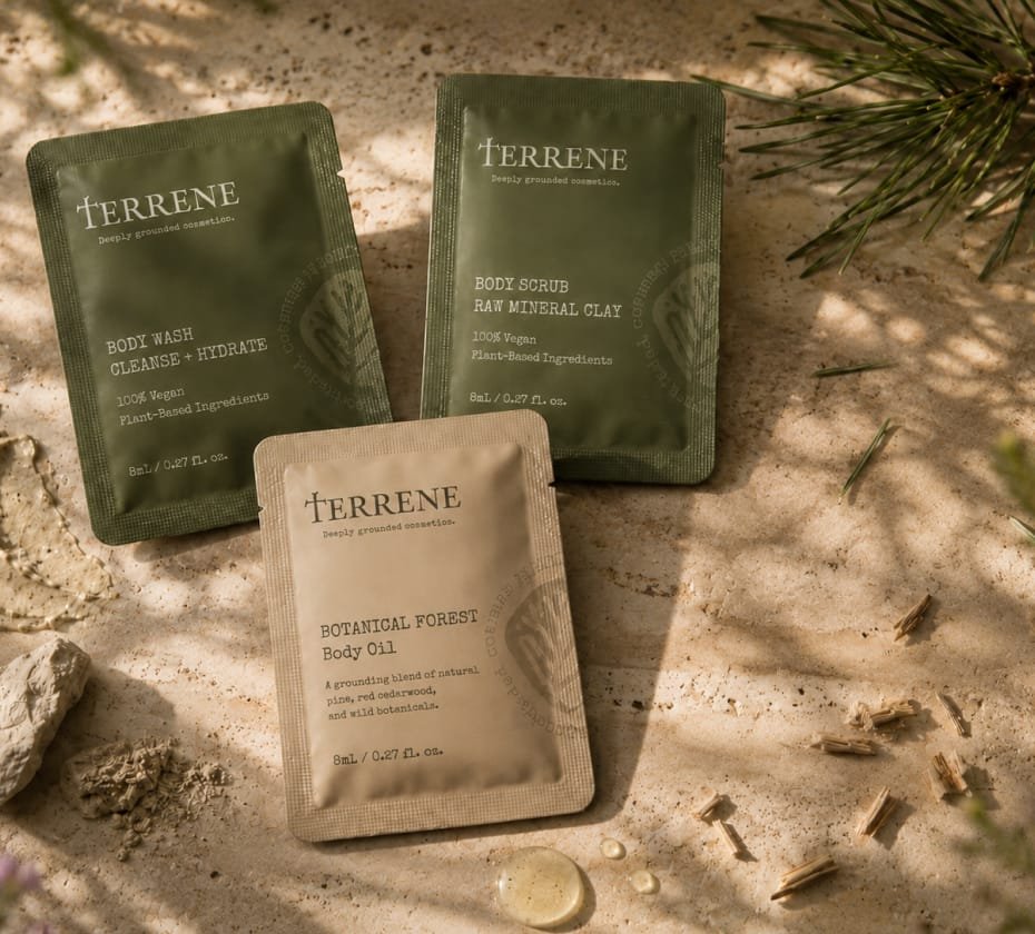
Packaging concept and visual applications across bottles, labels, sachets, wrapping paper and cosmetic accessories.



TERRENE is built around restraint, texture and a natural product rhythm, a skincare concept that feels grounded without losing clarity.