
Hani Nails Beauty Studio
A beauty studio identity developed across salon touchpoints, cosmetic product labels and client-facing materials, with a compact mark and a soft colour system.
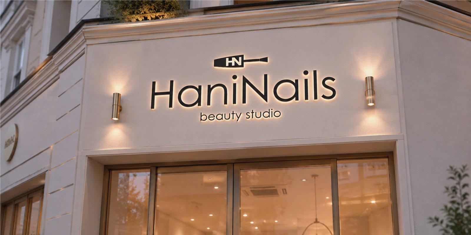
A salon identity that needed to work beyond the logo.
Hani Nails is a Ukrainian beauty studio built around professional nail care, refined service and a founder with international nail art competition experience. The identity needed to feel polished and trustworthy without becoming overly decorative.
The brand also needed enough structure to move from salon communication into related product applications, including cosmetic labels and small client-facing materials.
A soft visual system with a clear beauty reference.
The logo combines a clean wordmark with a compact brandmark inspired by the shape of a nail polish grip. This creates an immediate connection to the beauty category while keeping the overall identity minimal and flexible.
The name “Hani” also carries a soft association with “honey” in English, so the visual language was designed to feel gentle, memorable and precise rather than loud or trend-led.
A beauty identity ready for salon, product and launch use.
The final system brings together the wordmark, brandmark, Tiffany Blue and Deep Grey palette, typography and layout rules for everyday brand use.
The identity was extended into cosmetic product labels, including hand cream packaging, giving the studio a visual language that can support the salon experience, product presentation and future brand extensions.
Wordmark and brandmark designed for clear recognition across salon, product, print and digital touchpoints.
Colour palette, typography and layout direction shaped to feel calm, professional and easy to apply.
Identity applications adapted for cosmetic product labels, including hand cream packaging and related brand materials.
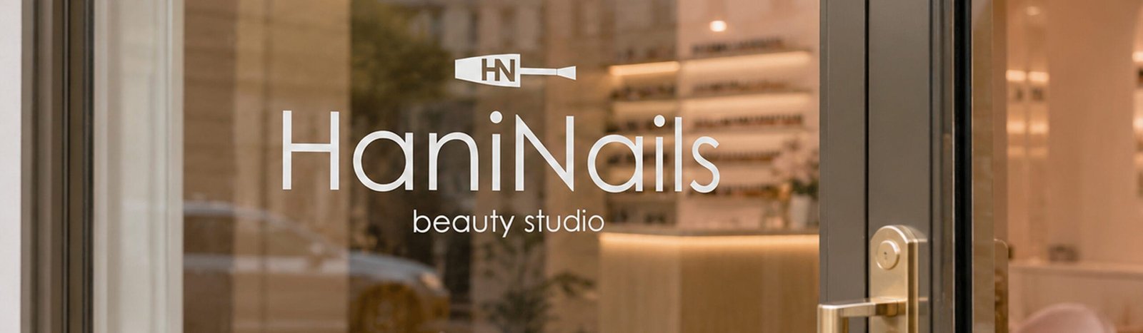
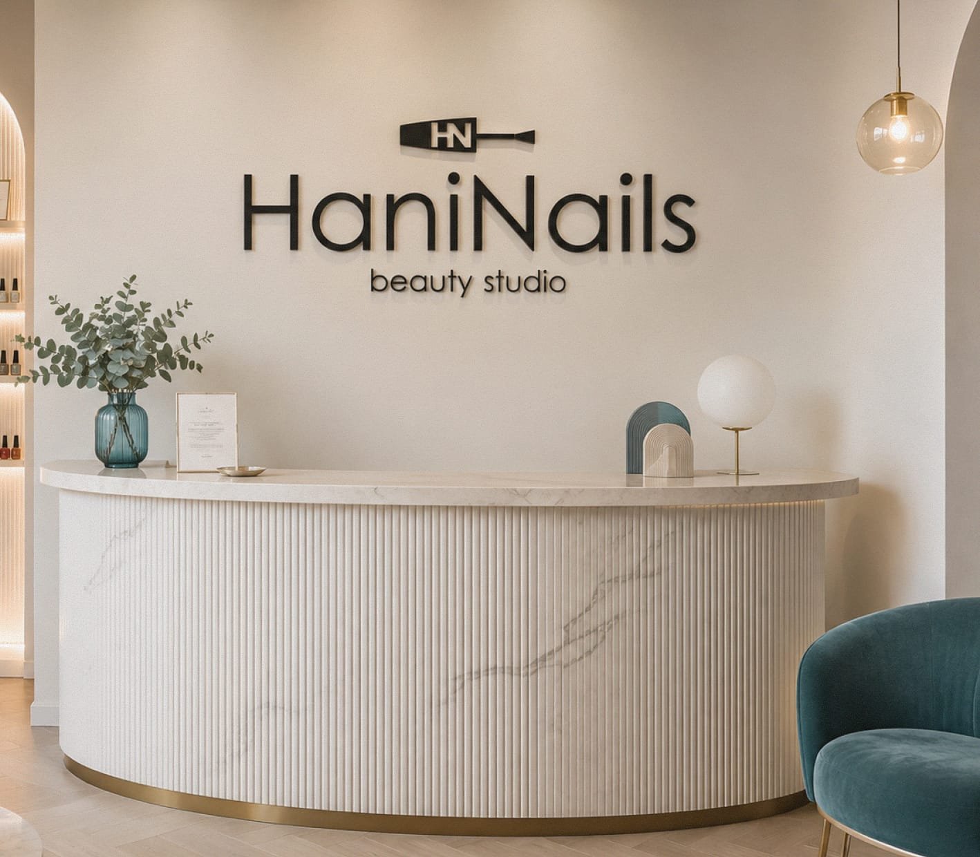
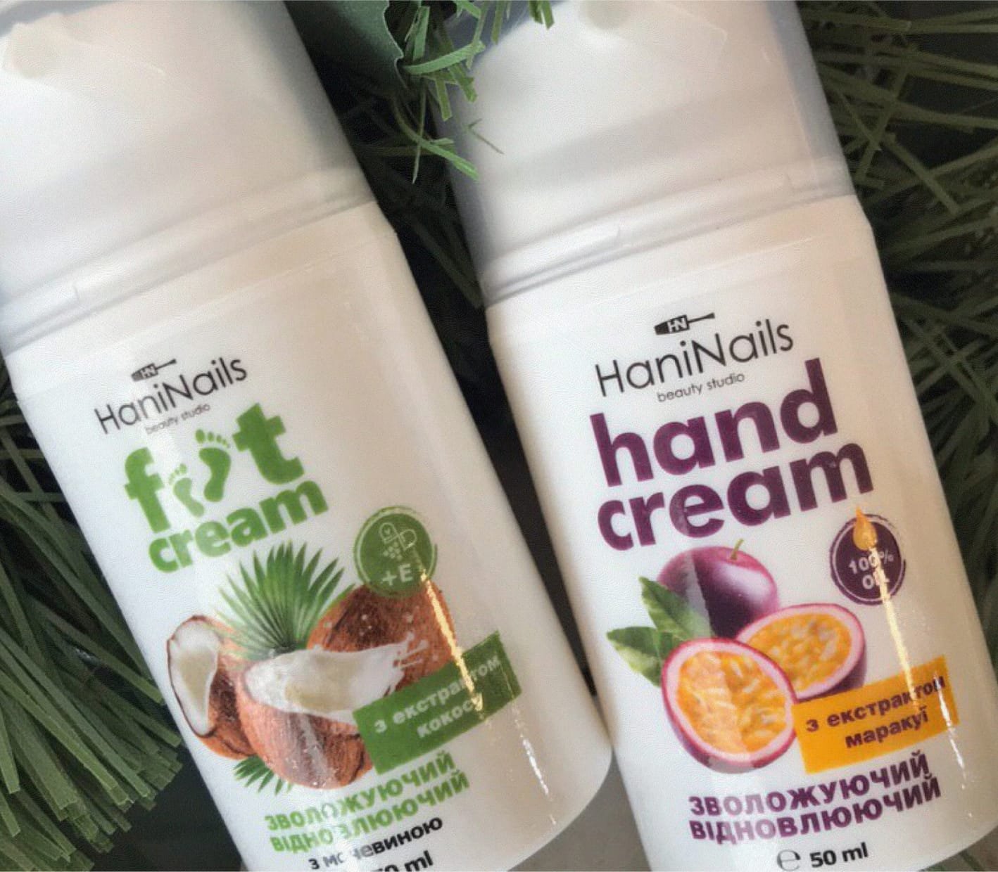
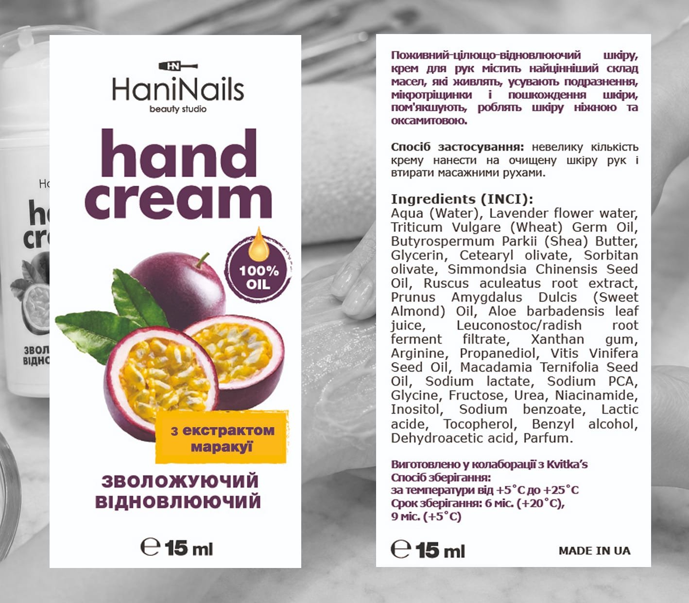
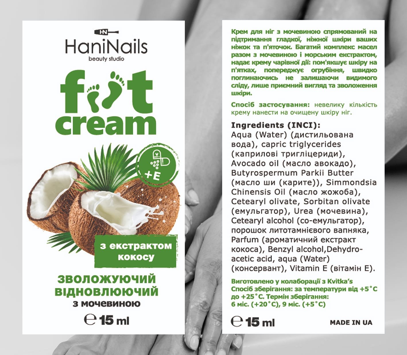
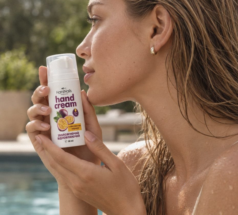
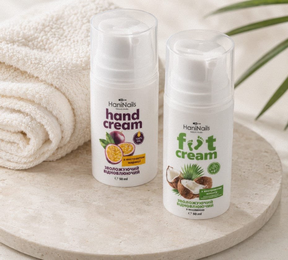
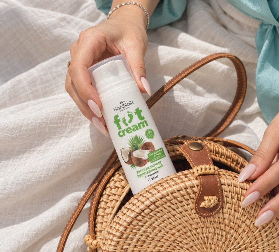
Hani Nails shows how a beauty identity can stay soft and elegant while still working across signage, product labels and everyday client touchpoints.