
TERRENE Skincare.
A natural body care brand identity and packaging concept inspired by forest rituals, mineral clays, pine oils and grounded self-care.

About the brand.
TERRENE is a natural body care brand inspired by forest rituals, clays, pine oils and grounded self-care. The brand was created around the idea of honest, tactile cosmetics — products that feel close to nature, carefully formulated and visually rooted in raw botanical materials.
TERRENE speaks to people who value quiet beauty, natural textures, intentional routines and a deeper connection to the earth.
Grounded beauty with botanical depth.
The main task was to create a visual identity that feels natural, grounded and refined, while avoiding the overly glossy language of traditional beauty packaging.
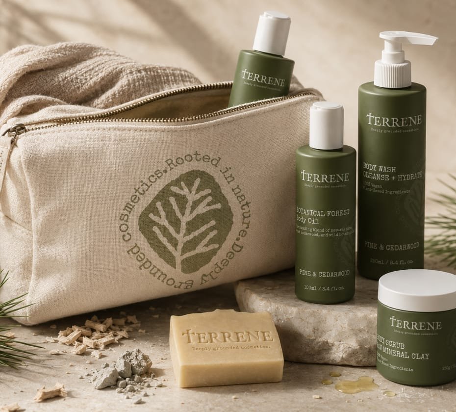
The concept combines warm minimalism with an apothecary-inspired aesthetic. The logo mark brings together the shapes of mineral clay, leaf veins and coniferous branches, creating a symbol that feels both botanical and elemental.
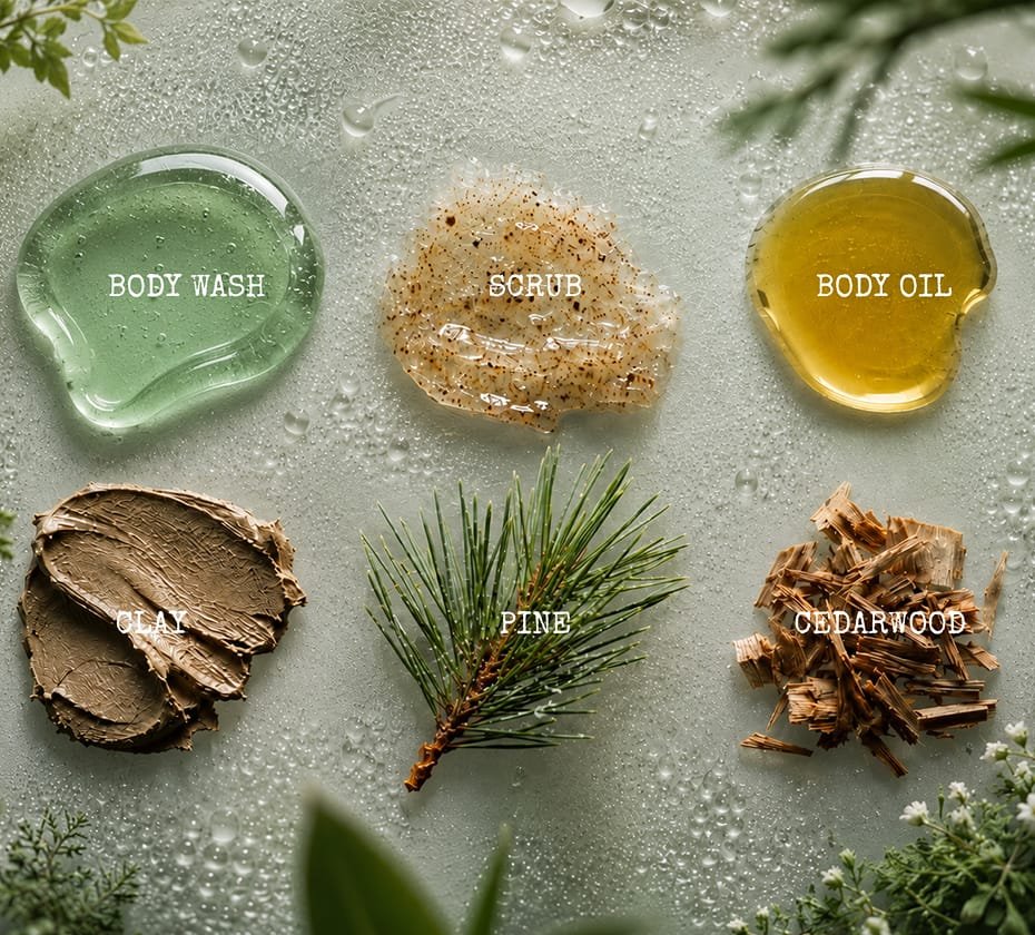
The typography adds a crafted, small-batch feeling, while the muted forest green, clay brown and soft cream colour palette reflects the natural ingredients behind the brand.
A tactile system with earthy refinement.
A flexible identity system was developed around a distinctive wordmark, a textured botanical symbol and a recognisable “T” monogram.
The visual language is intentionally imperfect, with softened edges and an ink-bleed effect that gives the brand a tactile, handmade quality.
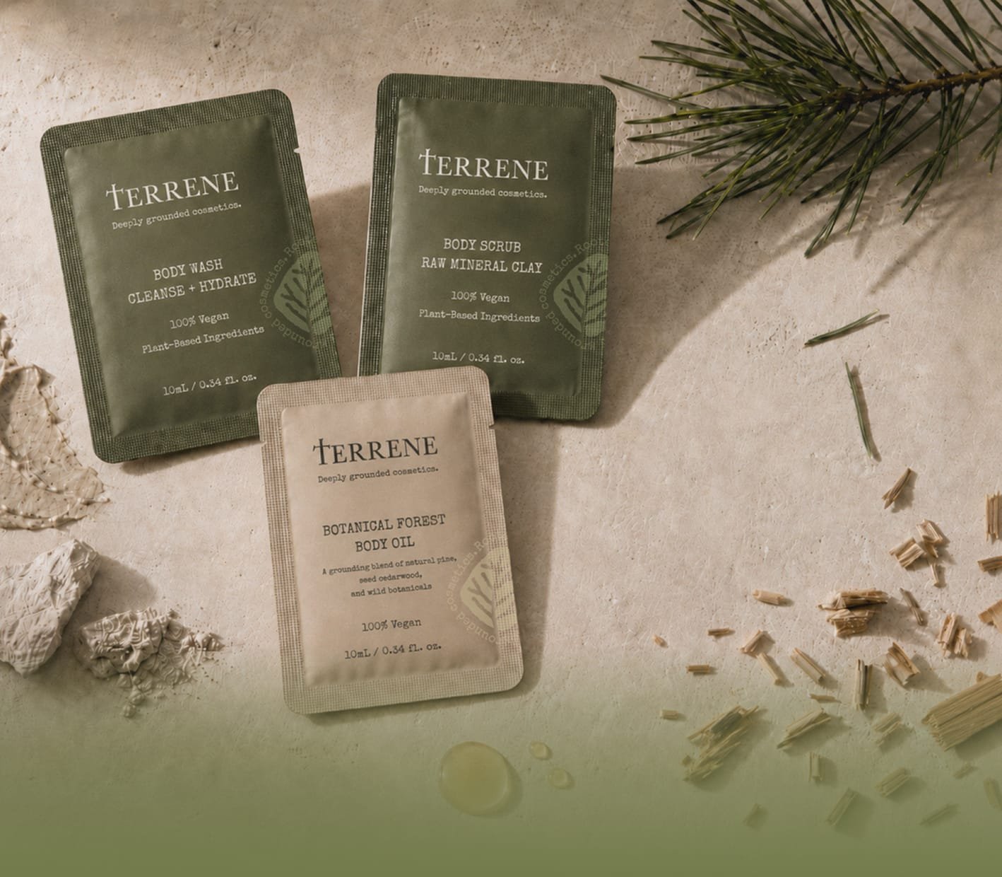
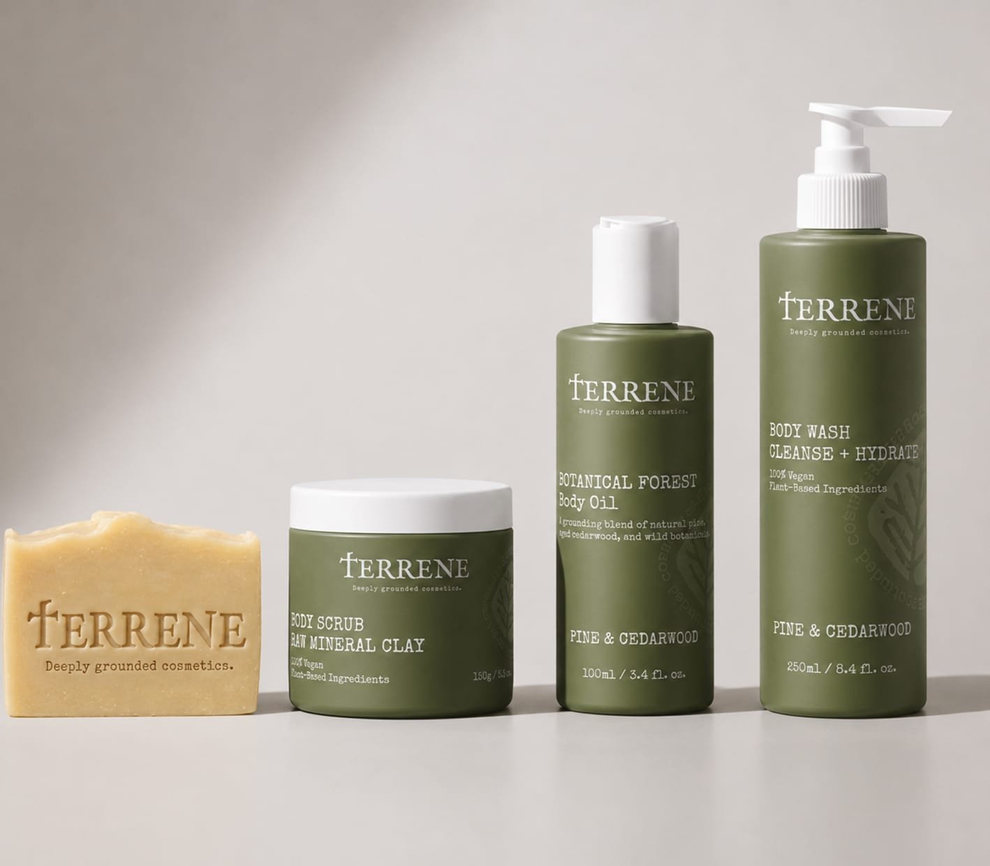
The identity can be applied across bottles, labels, sachets, wrapping paper, cosmetic bags and other brand materials, creating a cohesive system that feels calm, earthy and premium.
Natural packaging with quiet character.
The final concept gives TERRENE a calm, recognisable and cohesive visual presence. It communicates purity, texture and botanical rituals without relying on polished perfection or overly decorative beauty cues.
The result is a brand identity and packaging direction that feels close to nature, carefully made and ready to expand across a wider body care product line.
Distinctive wordmark, botanical symbol and recognisable “T” monogram designed for a grounded natural body care brand.
Muted forest green, clay brown and soft cream colour palette with typography and visual details inspired by tactile botanical materials.
Packaging and brand applications across bottles, labels, sachets, wrapping paper, cosmetic bags and other product touchpoints.

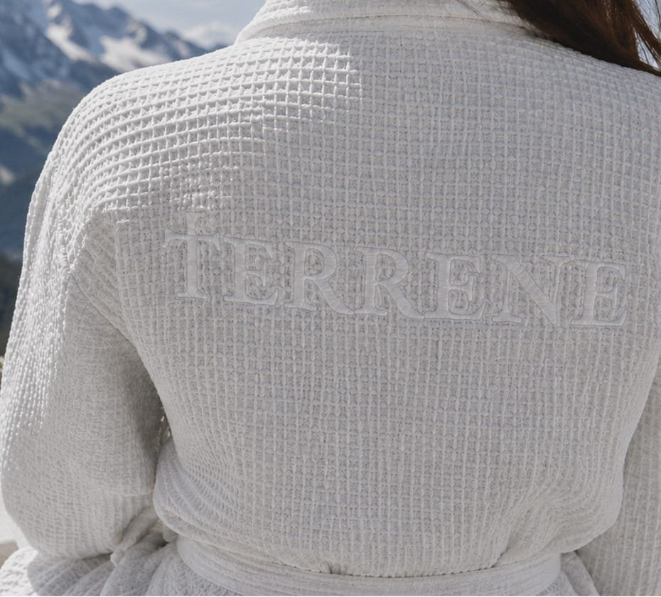
TERRENE is not about polished perfection. It is about purity, texture, botanical rituals and a quiet connection to nature.